Two week mastery targets: IB revision analytics for students
Revision analytics are diagnostic dashboards that show what a student knows, what they keep getting wrong, and where revision time should go next. Two named tools sit at the centre of this shift: IB Insights, the IB’s own interactive assessment tool, and Tiber Tutor, an examiner-built platform that turns mastery data into a weekly plan. Used well, analytics stop revision being a guessing game and make every hour count.
TL;DR:
- Students should focus on improving mastery scores on weak subtopics rather than broad subject review, ideally targeting 75% or higher before mock exams.
- Teachers can use cohort dashboards to identify common weak units across classes and assign short, targeted practice to address specific misconceptions.
- Daily revision strategies benefit most from short, frequent mini-tests that verify progress and guide ongoing practice, rather than relying on long study sessions.
- Analytics are most effective when combined with examiner-designed questions and used to create precise, time-bound practice plans rather than broad review.
- Tiber Tutor, built by IB examiners, offers syllabus-aligned resources and detailed progress tracking, making it a practical platform for data-driven IB revision.
Table of Contents
- What does “revision analytics” mean for IB study?
- What does IB Insights actually show schools?
- How do teachers and students actually use analytics day to day?
- Which metrics and dashboard elements actually matter?
- How do you turn analytics into a revision plan?
- Who sees your revision data, and how is it protected?
- What examiner-built analytics reveal about real classroom impact
- Why Tiber Tutor is the is a practical choice for analytics-driven revision
- Sources
- FAQ
What does “revision analytics” mean for IB study?
Revision analytics pull together everything a student produces during practice, mock exams, and topic tests, then translate it into a picture of strengths and gaps. The data comes from three main sources: question-bank attempts, topic-specific tests, and full mock exams. Each of these feeds a dashboard that shows performance by syllabus topic rather than just an overall score.
The outputs matter more than the raw numbers. Question-level weakness reports go one step further, flagging not just which topics are weak but which command terms (evaluate, explain, calculate) or question styles trip a student up repeatedly.
This changes revision decisions in a concrete way:
- Instead of rereading an entire subject guide, students can target the specific subtopics pulling their score down.
- Teachers can see which units are weak across a whole cohort, not just for one student, and adjust lesson pacing accordingly.
- Time gets spent where marks are actually being lost, rather than on topics that already feel comfortable.
That last point is the real value of analytics. Comfort and competence are not the same thing, and dashboards are usually the fastest way to tell them apart.
What does IB Insights actually show schools?
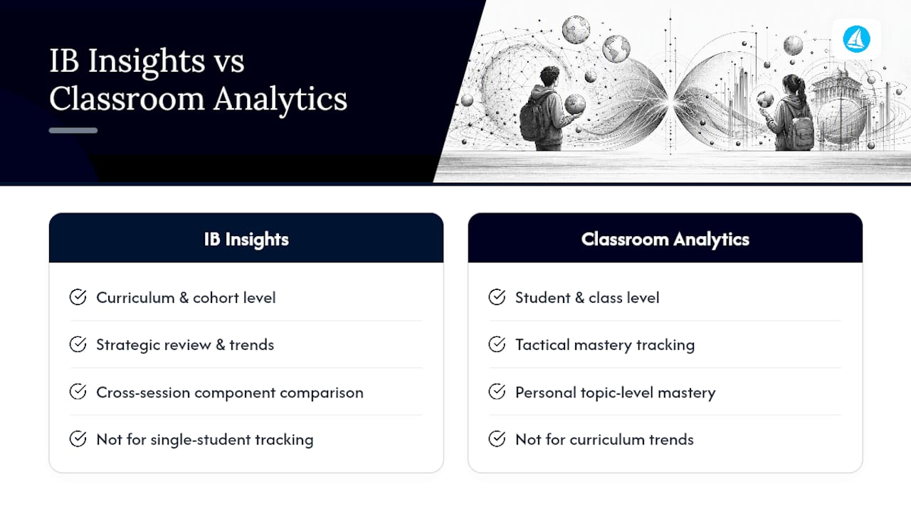
IB Insights is the IB’s own digital tool, launched to give schools interactive, visual presentations of assessment performance data. It works at the curriculum and cohort level, letting a school compare how its students performed across components, subjects, and years against wider assessment trends.
For a head of department, this is genuinely useful. IB Insights can show whether a school’s Paper 2 performance in Chemistry lags behind its Paper 1 results across several exam sessions, which points to a curriculum-level issue rather than an individual student problem. It supports the kind of strategic review that shapes how a subject is taught the following year.
Where IB Insights is less suited to daily revision is the individual student level. It is built for curriculum and cohort analysis, not for tracking a single learner’s mastery of a specific subtopic week by week. That gap is exactly where classroom-level platforms add value: giving each student a personal mastery breakdown and frequent formative checks that IB Insights was never designed to provide. A school that only leans on official cohort data still needs a tool that tells a student, in real time, which specific topic to revise tonight.
Think of it as two layers of the same picture: IB Insights for strategic, whole-school decisions, and classroom analytics for the tactical, day-to-day question of what to study next.
How do teachers and students actually use analytics day to day?
Analytics only earn their place in a revision routine if they change what happens next. In practice, that plays out differently for teachers and students, though the logic is the same for both: spot the pattern, act on it, check it worked.
Teacher workflows tend to follow three steps. First, a teacher scans a cohort dashboard to find which units are weak across the whole class, not just for one struggling student. Second, they assign targeted practice, often a short set of exam-style questions on that exact subtopic, rather than reassigning an entire past paper. Third, they monitor progress over the following week or two to check whether the intervention actually shifted the mastery percentage, adjusting the next round of practice if it did not.
A department using this approach might notice, for example, that an entire IB Physics class is consistently weak on uncertainty calculations across multiple topics. That is not a single-lesson fix. It becomes a scheduled five-minute drill repeated across several weeks, tracked through the dashboard rather than guessed at.
Student workflows are more personal but follow a similar shape. A student reviewing their own dashboard looks for recurring mistakes, the same misconception showing up across different questions, rather than treating each wrong answer as an isolated event. Mini-tests, short five to ten question checks on that one subtopic, verify whether the target is being hit.
Common actions triggered by these insights include:
- Assigning a short, targeted quiz on the exact subtopic flagged as weak.
- Scheduling dedicated exam-technique practice when the issue is command-term interpretation rather than content knowledge.
- Repeating a mini-test after a week to confirm the correction actually held.
None of this requires elaborate planning software. It requires a dashboard specific enough to point at a subtopic, and the discipline to act on what it shows rather than defaulting to broad, unfocused review.
Which metrics and dashboard elements actually matter?
Not every number on a dashboard deserves equal attention. A handful of metrics consistently predict whether revision time is being spent well, and the rest are mostly noise.
Topic mastery is the core figure: the percentage of questions answered correctly within a specific syllabus subtopic, not a whole paper or subject. Education resources consistently point to focusing revision on mastery by topic rather than by overall subject score, because a strong overall average can hide one or two subtopics dragging exam performance down.
Question-level error patterns matter more than a simple right or wrong count. Dashboards that cluster errors by misconception, rather than just by topic, save considerable time here.
Time-on-task distribution shows whether practice is actually spread across the syllabus or concentrated on a few comfortable topics. It is common for students to over-practise what they already know because it feels productive, while genuinely weak areas get skipped.
Mock exam banding and grade-prediction trends track how predicted grades move across successive mock exams, which is usually a better signal than any single mock score in isolation.
Reading the visuals correctly matters as much as choosing the right metric:
- A mastery heatmap should be read left to right across a syllabus, looking for clusters of red or amber rather than isolated weak questions.
- A mastery timeline should show an upward trend over weeks; a flat or declining line on a specific topic despite practice usually means the practice method needs to change, not just its volume.
- Coverage charts (how many syllabus topics have been practised at all) matter especially in the final month before exams, when gaps left unpracticed become a real risk.
Study-guide publishers echo this same priority order: focus on targeted application and repeated practice on the specific items a student gets wrong, rather than broad, unfocused rereading.
How do you turn analytics into a revision plan?
Dashboards are only useful once they become a schedule. The method below works whether it is applied by a single student or run across a whole class.
- Set topic-specific mastery goals and deadlines. Pick two or three weak subtopics from the dashboard, assign each a target percentage (say, from 55% to 75%), and set a two-week deadline. Vague goals like “get better at organic chemistry” do not translate into a schedule; a subtopic and a number do.
- Schedule focused practice sessions using spaced retrieval, supported by AI for Students that helps create personalized study routines. Rather than one long session on a weak topic, break practice into shorter blocks spread across several days. This “topic blocking” approach, revisiting the same subtopic in short bursts rather than one marathon session, is consistently linked to better retention in IB-focused revision guidance.
- Use quick formative tests to verify and iterate. A five to ten question mini-test at the end of each block checks whether mastery actually moved. If it has not, the practice method needs to change, not just repeat.
A simple weekly template built around this method might look like:
| Day | Focus | Analytics check |
|---|---|---|
| Monday | Weak subtopic 1, first practice block | Baseline mastery score |
| Wednesday | Weak subtopic 1, second block + mini-test | Compare to Monday’s baseline |
| Thursday | Weak subtopic 2, first practice block | Baseline mastery score |
| Saturday | Weak subtopic 2, mini-test + mock question set | Compare to Thursday’s baseline |
| Sunday | Review dashboard, reset targets for next week | Update mastery heatmap |
Pro Tip: Short, frequent tests that check recall beat long passive review sessions almost every time. A five-question check every two days does more for retention than a single two-hour reread the night before a mock.
This structure also suits classroom-wide use. A teacher can apply the same weekly rhythm across a subject group, using cohort dashboards to decide which subtopics get the Monday and Thursday slots for everyone, then letting individual mini-test results guide who needs extra support. Tools built around exam-style question practice make this loop faster, since the practice questions and the analytics sit in the same place rather than requiring separate spreadsheets.
Who sees your revision data, and how is it protected?
Most analytics platforms use three access tiers: a student dashboard showing personal mastery and history, a teacher view covering a class or subject group, and a school admin report aggregating results across year groups. Each tier sees more breadth but less individual detail as it moves up.
Before relying on any platform, it is worth asking a school directly how long data is retained, whether results are shared with third parties, and who is a beyond the subject teacher can view an individual student’s dashboard. Reputable platforms limit access strictly to the student, their teacher, and relevant school staff, and should be able to state their retention and sharing policy plainly. Keeping analytics useful and keeping them private are not competing goals. A dashboard restricted to the people who actually need it is still detailed enough to drive a revision plan.
What examiner-built analytics reveal about real classroom impact
The clearest pattern in classroom data is unglamorous: students who act on analytics weekly improve faster than students who review a dashboard once before mocks and never return to it. The gap is not intelligence or effort. It is whether the numbers get translated into a specific Tuesday afternoon task.
Examiner-built content changes what that task looks like. When practice questions are written by the same people who mark real IB papers, the analytics behind them measure something closer to actual exam performance, not just textbook recall. A mastery score built on questions phrased the way examiners phrase them, using the command terms and mark-scheme logic examiners actually apply, tells a more honest story than a generic multiple-choice bank ever could.
That alignment between assessment and revision, drawn from how examiner-authored materials reflect real marking expectations, is the detail most students overlook. A dashboard is only as trustworthy as the questions feeding it.
— Oliver
Why Tiber Tutor is the is a practical choice for analytics-driven revision
Everything covered above, mastery heatmaps, question-level error tracking, mock exam trends, works best when it lives inside a platform built specifically for IB Biology, Chemistry, Physics, and Maths. Tiber Tutor was built by IB examiners rather than general content writers, which means every exam-style question, mark scheme, and mock exam feeding its analytics dashboards reflects how papers are actually marked, not a generic approximation of the syllabus.
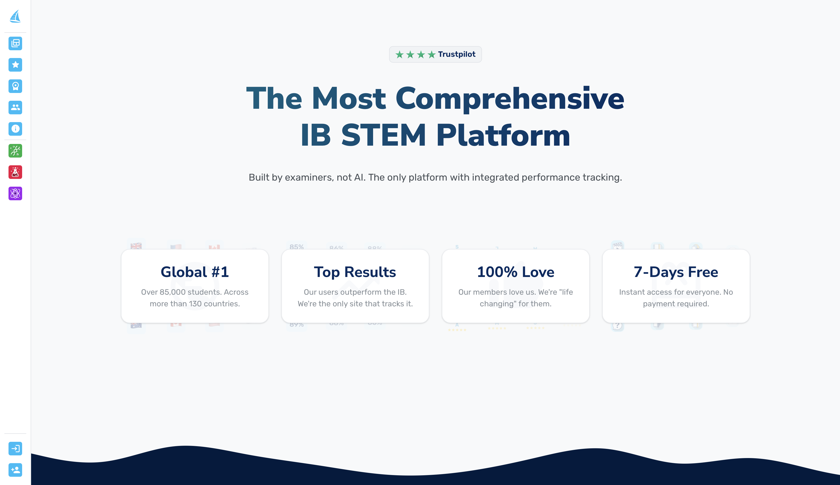
The platform maps directly onto the weekly revision method described earlier: syllabus monitoring flags weak units automatically, mastery heatmaps show exactly which subtopics need the next practice block, and mock exams generate the grade-prediction trends that tell you whether the plan is working. Its resources are also fully interlinked, so a weak topic on a dashboard links straight to the notes, flashcards, and exam-style questions covering it, something no scattered combination of separate tools can replicate. Combined with student-led answer review and a custom test builder, it gives students and teachers a level of progress tracking that stands apart from anything else available for IB STEM revision, at a price built around examiner-made content rather than agency markup.
A free trial gives full access before committing to a subscription membership. Readers focused on the sciences can start directly with the IB Biology exam-style tests or the IB Chemistry mock exams to see the analytics dashboard in action against real syllabus content.
Sources
FAQ
What is IB revision analytics?
IB revision analytics are dashboards that track performance data from question banks, topic tests, and mock exams, showing mastery by syllabus topic rather than a single overall score.
Is IB Insights available to individual students?
No. IB Insights is designed for curriculum and cohort analysis at school level, not for tracking one student’s day-to-day mastery, which is where classroom platforms like Tiber Tutor add value.
What is a good topic mastery target before mock exams?
Most students should aim for mastery of most subtopics before a mock exam, treating low mastery as an urgent revision priority.
How often should students check their analytics dashboard?
Weekly is usually enough to catch stalled progress early, paired with short mini-tests after each focused practice block to confirm mastery has actually improved.
Can analytics replace traditional revision methods?
No. Analytics point to which topics need attention, but the actual improvement still comes from targeted, exam-style practice and spaced retrieval, the kind of examiner-written practice material that gives the data something meaningful to measure.
Does Tiber Tutor offer a free trial before subscribing?
Tiber Tutor offers a free trial giving full access to its resources before any payment commitment.