IB Maths AI 4.2 Notes
This page contains our IB Maths AI notes for 4.2. By reading each one of these notes, you will fully cover the content for IB Maths AI 'Visualising statistics'.
Histograms
Data can often be understood much more clearly when it is displayed visually. In this section, the main statistical diagrams are histograms, cumulative frequency graphs and box-and-whisker diagrams. These help show the shape, spread and position of data, and they are useful when comparing distributions. A histogram is used to display grouped continuous data. The data is divided into class intervals, and each bar represents one interval. Since the data is continuous, the bars touch. At SL, only frequency histograms with equal class intervals are required. Frequency density histograms are not required. A histogram shows:
If the bars are tallest in the middle and decrease evenly on both sides, the distribution is roughly symmetric.
- If the bars stretch further to the right, the distribution is positively skewed.
- If the bars stretch further to the left, the distribution is negatively skewed.
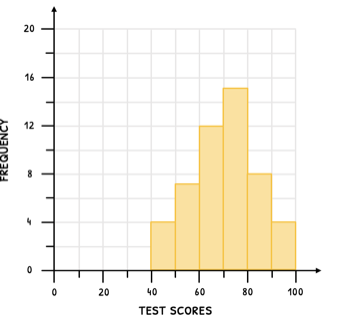
The grouped data below shows test scores. Draw a histogram for this data.
Class interval Frequency A histogram would have six touching bars with heights .
This suggests the scores are concentrated around the interval .
Image reference: histogram with equal class intervals showing a roughly symmetric distribution.
tibertutor.com
Next Up
You have completed the sub-topic 4.2 notes, covering "Visualising statistics" for IB Maths AI - continue with related resources below or explore the full IB Maths AI course from the IBO.
Other Sub-topic 4.2 resources